the Creative Commons Attribution 4.0 License.
the Creative Commons Attribution 4.0 License.
 | 21 Sep 2023
Uncertainty in three dimensions: the challenges of communicating probabilistic flood forecast maps
Valérie Jean
Marie-Amélie Boucher
Anissa Frini
Dominic Roussel
Real-time operational flood forecasting most often concentrates on issuing streamflow predictions at specific points along the rivers of a watershed. However, we are now witnessing an increasing number of studies aimed at also including flood mapping as part of the forecasting system. While this additional new information (flood extent, depth, velocity, etc.) can potentially be useful for decision-makers, it could also be overwhelming. This is especially true for probabilistic and ensemble forecasting systems. While ensemble streamflow forecasts for a given point in space can be visualized relatively easily, the visualization and communication of probabilistic forecasts for water depth and extent pose additional challenges. Confusion typically arises from too much information, counterintuitive interpretation, or simply too much complexity in the representation of the forecast. The communication and visualization of probabilistic streamflow forecasts has been studied in the past, but this is not the case for the probabilistic flood forecast map, which is still an emerging product. In this paper, we synthesize the results of a large-scale survey (28 government representatives, 52 municipalities, 9 organizations, and 38 citizens and farmers, for a total of 140 people) regarding the users' preferences in terms of visualizing probabilistic flood forecasts over an entire river reach. The survey was performed through interviews, during which the interviewees were asked about their needs in terms of hydrological forecasting. We also presented the interviewees with four prototypes representing alternative visualizations of the same probabilistic forecast in order to understand their preferences in terms of colour maps, wording, and the representation of uncertainty. Our results highlight several issues related to the understanding of probabilities in the specific context of visualizing forecasted flood maps. We propose several suggestions for visualizing probabilistic flood maps and also describe potential adaptations for different categories of end users. This study is the first to investigate the visualization of probabilistic flood maps, which are gaining popularity. Given that the interview questions were not tied to a specific geographical location, our findings are applicable outside of the study area and, therefore, to other operational centres interested in providing probabilistic flood forecast maps to decision-making organizations and citizens.
- Article
(2214 KB) - Full-text XML
- BibTeX
- EndNote


Effectively communicating the risks related to extreme climate hazards to the various stakeholders in a territory is critical. This is particularly true in the case of flood-related risks and the persistent potential human and economic costs (e.g., Haer et al., 2016). In the last 15 years, many hydrological forecasting agencies around the globe have moved from deterministic to ensemble and probabilistic forecasts (Wu et al., 2020). Many forecasts now include not only flow but also water depth and extent (e.g., Crotti et al., 2019; Zarzar et al., 2018). Communicating these forecasts poses multiple challenges because, unlike flow, water extent and depth must be presented in three dimensions, and the inherent uncertainty applies to all three. The greater amounts of available information require an adaptation of the communication techniques and visualization tools. The main goal is to produce a forecast that users can easily interpret to react adequately to a flood.
The notion of uncertainty associated with forecasts is generally well accepted by users (e.g., Stephens et al., 2019; Joslyn and Savelli, 2010). However, the challenge lies more in properly translating uncertainty, giving it the appropriate meaning, and linking this information to decision-making (e.g., Ramos et al., 2010).
In this sense, the effects of uncertainty on decision-making are critical for understanding how to properly communicate forecasts (Kox et al., 2015). Deciding to act on the basis of uncertain information implies the ability to anticipate a situation, a problem, or possible risks (Belin et al., 2019). Various factors influence anticipation and decision-making from uncertain information. One factor is that the perception of the anticipated situation, as demonstrated by Reghezza-Zitt (2019), is necessarily partial, because people's perception of the situation is influenced by their specific role. For instance, a municipal official for civil security will have a different perception than a farmer. Moreover, interpretation and intuition are invariably involved in anticipating and planning for crises. November et al. (2020) point out that the flow of information and its relevance and quality are crucial to the user’s decision-making. However, even good, accessible information does not guarantee that it is understood correctly (e.g., Joslyn and Savelli, 2010; Carr et al., 2016; Padilla et al., 2018).
An impact-based forecasting product aims to present the immediate and direct consequences on the land or communities and provide more tangible information to help decision-making (Pielke Jr. and Carbone, 2002). Speight et al. (2018) showed that pairing heavy-precipitation forecasts with impact probabilities in relation to specific territorial issues, e.g., population, residences, roads, and railroads, allowed users to make more informed decisions. According to Anderson-Berry et al. (2018), community safety and resilience depend directly on communicating the links between the hazard, e.g., the probability of flooding, and the potential concrete consequences.
Several studies have focused on forecast users and how they interpret probabilistic forecasts, although most of this literature relates to weather forecasting and not hydrology. Fundel et al. (2019) surveyed three distinct groups of users in terms of both their training and their needs for weather forecasts. Their study developed four probabilistic forecast visualization tools – incorporating the best practices identified in the literature – and presented these to the participants. The authors found common visualization preferences among the three user groups but some differences. For instance, all categories of users found the information about the probabilities of exceeding a threshold to be useful. However, some also liked the information about quantiles, whereas others found it completely useless. Thus, visualization tools should be altered slightly in relation to the user. Fundel et al. (2019) also showed that informed decisions require users to know the uncertainty attached to the forecast. Kox et al. (2018) conducted a similar investigation, focusing specifically on decision-making and the impacts of extreme weather events, to identify the most essential attributes of a forecast for users and understand why these specific attributes are key. They interviewed a diverse group of individuals who were brought together in small workshops during which the participants were presented with precipitation and lightning storm forecasts. Several users emphasized the importance of relating forecast information to decision-making processes, e.g., to warning levels. Several noted that they preferred the frequency of forecast publication to be non-uniform over time. Finally, participants suggested that the forecast visualization tool should incorporate some sort of informal social network to allow users to communicate with each other and add information to the tool, particularly in regard to impacts. This information based on individual experiences makes the information conveyed by the forecasting system more tangible.
Carr et al. (2018) studied how citizens and emergency managers analyse and understand probabilistic hydrologic forecasts issued by the National Weather Service (NWS) in the United States to propose ways of improving the visualization of these forecasts. The researchers presented visualization tools using in-person focus groups, online surveys, and webinars. Among the presented tools was a graph of water level versus time for a specific location, on which the mean value was given along with a confidence interval. The graph used shades of blue to represent probabilities. Emergency officials reacted very positively in general to this visualization; however, citizens reacted negatively to this tool, saying that they did not understand the graph or how to interpret it. Carr et al. (2018) concluded that limiting the amount of information presented on a single graph is important. A diagram that is too dense can be confusing, as the user can no longer distinguish between essential and supplemental information. The authors also suggested that adding text to explain probabilities could benefit the interpretation of the tool by the general public.
Various biases can hinder or influence a user’s decoding of a visualization tool (Padilla et al., 2018). The first relates to cultural conventions. When we interpret a map, a graph, or a colour scale, we do so based on a set of familiar conventions, e.g., reading from left to right and top to bottom. Information that deviates from these conventions requires more attention from the user to interpret the visualization and may lead to errors. Padilla et al. (2018) also identify spatiotemporal bias. This bias refers to the boundaries used to represent an event and the risk of giving the user the impression that there is a clear boundary. In reality, these boundaries do not exist. Although this is easy to understand in theory, eliminating this bias in practice is challenging; this is especially true for flood forecast visualization where very sharp boundaries of the flooded area can lead to this spatiotemporal bias. Finally, Møyner Hohle et al. (2018) highlight the directionality bias in relation to the interpretation of probabilities. Many respondents in their survey considered a probability greater than X% to represent an upward trend relative to a past state and even into the future, whereas a probability less than Y% represented a downward trend that would also continue. Therefore, the direction in which probabilities are presented must be considered carefully. Grounds et al. (2017) proposed that giving a probability interval rather than an outlier (or non-outlier) probability helps people to correctly interpret probabilities. The probability interval also allows people to refine the range of possible values; the interval defines a likely area beyond which the event of interest is unlikely.
In addition to interpretation bias, the choice of a colour scale can be critical to users’ perceptions and understanding. Carr et al. (2016) asked residents of two communities in a hurricane-prone area in the United States questions about predicted flood maps on which shades of blue reflected different water depths. The respondents did not link the blue tones and water depth. Carr et al. (2016) recommended that flood maps (1) foster a greater level of interaction between the tool and the user and (2) add visual cues related to the land, e.g., a photo of the water level attained at a well-known location.
Kox et al. (2015) documented the choice of words to communicate uncertainty and observed that the interpretation of uncertainty may be difficult for some users when this information is translated only into a percentage probability. Words are useful for supplementing the uncertainty in the probability estimate; therefore, a combination of verbal and numerical expressions may be best. Engeset et al. (2018) made similar conclusions. Finally, the choice of words can influence users’ confidence in forecasts. For example, Fundel et al. (2019) observed that the reaction tends to be more positive when individuals are presented with information about the level of confidence rather than the level of uncertainty. Another previous study by Demeritt et al. (2010) took place at a time when ensemble flood forecasts were a new concept in operational hydrology. Their research followed a qualitative methodology based on long interviews, and they were not concerned about the visual presentation of forecasts but rather more about the concepts themselves and the operational uptake of ensemble (rather than deterministic) streamflow forecasts. There was no question of probabilistic flood forecast maps at that time.
The above-cited research highlights the importance of conducting focused surveys of forecast users to target the optimal methods and choices for communicating and visualizing probabilistic information, but none of those studies specifically focus on flood maps, because producing flood forecast maps is an emerging practice. In fact, apart from Carr et al. (2016, 2018), none of the studies cited above focused specifically on hydrological forecasts. Abundant literature exists regarding the communication of probabilistic weather information, especially for extreme events like hurricanes. In the case of Carr et al. (2016, 2018), the attention given specifically to flood forecast maps is marginal. It occupies a small portion of Carr et al. (2016) and is not studied in Carr et al. (2018), the latter of which rather focuses on the communication of more widespread ensemble streamflow forecasts. Our study is the first to concentrate exclusively on the communication of probabilistic flood forecast maps, which is an emerging product. It is a novel contribution, which provides practical recommendations for the communication of this emerging type of forecasts to different groups of users. We present a broad survey of various users of hydrological forecasts: government officials from multiple ministries, municipal emergency officials, agency representatives, farmers, and citizens. This survey forms part of a project to improve the hydrological forecasts produced by the Quebec (Canada) provincial government. Following particularly damaging spring floods in 2017 and 2019, the government established INFO-Crue, a programme to improve the mapping of flood-prone areas and elements related to hydrological forecasts. Among these elements is the hydraulic modelling of several river sections to add a forecast of water height and extent to the existing flow forecasts. Some private providers are already producing water-level forecasts for some rivers in Quebec. This study focuses on the hydrological forecasting system of the Quebec government.
Because flow forecasts are probabilistic, the produced depth and extent forecasts will also be probabilistic. The probabilistic nature of these forecasts poses several challenges for their presentation and dissemination to users in regard to describing a spatialized variable and including the uncertainty inherent in the three (x, y, z) dimensions. Several questions arise that this study aims to address:
-
How can one best represent all three dimensions on the same map?
-
How useful is a colour scale to represent water depth?
-
Is a single visualization tool sufficient to accurately communicate all of the information or should it vary among users and their diverse needs?
We first detail the study area (Sect. 2) and then describe our methodology (Sect. 3). We then present the results of interviews with all user groups (Sect. 4) and discuss the key findings and outline the main recommendations (Sect. 5). Section 6 concludes our paper and provides some food for thought regarding the future development and publication of flood forecast visualization tools.
The province of Quebec (Canada) is characterized by a vast territory and an extensive hydrographic network. There are nearly 15 000 watercourses, including more than 12 000 streams and 3134 rivers. In addition to these numerous waterways, the St. Lawrence River, one of the longest rivers in the world with a drainage basin of approximately 1.6 × 10⁶ km2, flows through southern Quebec. Because of the northern climate across the province, the hydrological regime has a very marked annual cycle. Floods occur mainly in the spring when snow melts. Spring ice jams are another major cause of flooding on many rivers.
Although flooding is common in the spring, the 2017 and 2019 floods were exceptional. In the spring of 2017, snowmelt and heavy rains resulted in significant flooding, affecting 15 regions, 291 municipalities, and more than 5300 residences. Nearly 4000 people were evacuated, and 400 roads were damaged. During the 2019 spring floods, 13 500 people were evacuated, and 5000 homes were flooded (Ministère de la Sécurité publique, 2018). Although floods cause numerous deaths in many regions of the world, this is normally not the case in Quebec because spring flood currents are generally quite slow. The flood-prone areas considered in this survey are found mainly in the southern part of the province (Fig. 1).
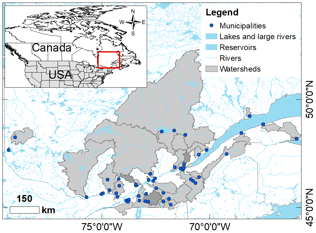
Figure 1Geographic location of the study area in southern Quebec, including participating municipalities (blue dots) and watersheds (grey zones). This map was designed by the second author using copyright-free layers from Données Québec (2018), ESRI (2022), and Statistics Canada (2021).
3.1 Operational forecasting chain
Deterministic streamflow forecasts are obtained by feeding HYDROTEL (a distributed physics-based model) with deterministic meteorological forecasts (precipitation and temperature) from Environment and Climate Change Canada. Then, the deterministic streamflow forecasts are dressed statistically, using a method based on an analysis of previous errors between forecasts and observations (Huard, 2013). This can be seen as post-processing and encompasses many sources of uncertainty all at once. In addition, forecasters perform manual data assimilation at the onset of the forecast. They apply perturbations to the most recent meteorological observations and rerun HYDROTEL in simulation mode to obtain new state variables from which the forecast will start. As for the hydraulic component, it is based on the Hydrologic Engineering Center's River Analysis System (HEC-RAS) model with a fixed parameterization (e.g., Manning coefficients). Consequently, the uncertainty that is accounted for by the current forecasting chain is strictly a result of the probabilistic streamflow forecasts used to feed HEC-RAS, and this uncertainty is estimated via the statistical dressing method of Huard (2013).
3.2 Qualitative survey: sampling strategy and participants
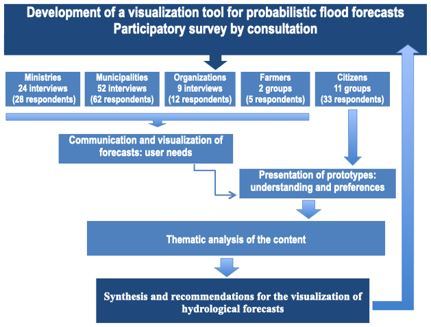
Our qualitative methodology followed commonly applied participatory approaches (e.g., Roque et al., 2022). It consisted of a broad consultation conducted with various territorial actors likely to use the future forecast visualization tool. Our consultations took place from June 2020 to June 2021, and we targeted four groups of actors:
-
managers and stakeholders from different ministries who act as support for municipalities or who manage infrastructure or territories potentially affected by floods;
-
municipal civil security officials who are responsible for the safety of residents on their territory and who intervene directly during flood events;
-
territorial organizations, particularly watershed organizations (organismes de bassin versant; OBV) (which are responsible for the integrated water management within a watershed), the Union des producteurs agricoles (UPA) (which has a role in supporting and accompanying farmers), and the Financière agricole (which provides financial support to agriculture, particularly through crop insurance, to compensate for agricultural losses owing to a hazard associated with climatic conditions, including flooding);
-
citizens and farmers affected by flooding and who often live near a river subject to flooding.
We used separate sampling strategies for the different user groups. The applied sampling strategies depended in part on group size. For example, selecting participants for the first group of ministerial representatives was straightforward given the small number of members in this group. In contrast, the selection of municipalities was more complex owing to the number of municipalities of all sizes that vary in their risk of being affected by flooding. In all cases, each individual was contacted by telephone to explain the project and the contribution expected from the participant.
In qualitative research, sample size can be determined by saturation. Saturation is reached when no new information can be obtained by conducting additional interviews (i.e., the new participants repeat information that was already provided by previous participants). In their recent multidisciplinary literature review, Hennink and Kaiser (2022) concluded that saturation was generally reached after a maximum of 17 focus groups. Another comparative study by Hagaman and Wutich (2017) concluded that 20 to 40 interviews are generally needed to reach saturation, but this was for the case of qualitative studies covering large territories with potential cultural differences between participants. Interestingly, the study of Hagaman and Wutich (2017) is based on a cross-cultural research project on water-related issues. It involved 132 respondents in four different countries, but they found that saturation was reached after far fewer than 132 interviews. Note that the study of Hagaman and Wutich (2017) is one of the 23 qualitative studies reviewed by Hennink and Kaiser (2022), and their sample size is by far the largest among the 23. The second largest study had a sample size of only 60. Similarly, the sample of Demeritt et al. (2010) included only 50 respondents, spread across 17 European countries.
In our study, even though there are differences between the characteristics of the four groups of respondents, they all have a similar general background, with no prior experience with flood maps, and they also come from the same country. Therefore, it is a relatively homogenous group. According to Hennink and Kaiser (2022), 140 is considered a very large number of participants for that type of long (2–3 h) interview. Note that our study is the first of its kind in Canada, so there are no other comparable studies.
The specific elements of the applied methodology protocol for each group of participants are detailed in Sect. 3.2.1 to 3.2.4 (see also Fig. 2).
3.2.1 Managers and stakeholders from various ministries
For this group, we identified representatives from all of the ministries concerned with the issue of flooding. The selection of these representatives ensured various regional realities and diversity in the participants’ areas of expertise. No restrictions were imposed other than their probable future use of the forecasting system. We conducted 24 interviews, and 28 respondents participated, i.e., some interviews were conducted with more than one respondent. The participating government ministries were as follows:
-
the Quebec Ministry of Public Security (MSP), responsible for ensuring the physical and material security of the population and, in particular, supporting municipalities during crises;
-
the Quebec Ministry of Transport (MTQ), responsible for the provincial road network;
-
the Quebec Ministry of Energy and Natural Resources (MERN), responsible for managing public lands;
-
the Quebec Ministry of Health and Social Services (MSSS), responsible for ensuring the health of individuals and communities;
-
the Quebec Ministry of Municipal Affairs and Housing (MAMH), responsible for assisting municipalities in carrying out their various functions.
3.2.2 Municipal public safety officials
This group involved numerous participants and included municipalities of all sizes with various degrees of flood risk. We undertook stratified random sampling to cover all areas of the study region with these considerations in mind. A list of 1145 municipalities in potentially flood-prone areas was used as a starting list. These municipalities were divided into strata according to their size and their level of flood risk – measured by estimated population and number of essential buildings on the floodplain.
A preliminary analysis categorized municipalities into four population (P) classes (P<1000, , , and P≥100 000) and three risk levels (low, medium, and high) to create strata, with each stratum corresponding to a cross of municipality size and risk level. We also assigned each municipality an identification number on the basis of the administrative region to which it belonged. We sorted the municipalities using these identification numbers and applied systematic random sampling of the numbers by step. We therefore obtained municipalities in all regions.
Finally, to form the sample, we retained 2 % of the low-risk municipalities, 5 % of the moderate-risk municipalities, 20 % of the high-risk municipalities, and 100 % of the large cities with more than 100 000 inhabitants. However, we excluded the cities of the Montréal urban community, which have their own forecasting system and asked not to be included. The selection of municipalities was performed by random draw (except for the large cities). We initially selected 70 municipalities. Some were removed either because they were not located in a priority watershed according to the ranking of Frini et al. (2019) or they had already been approached by other projects. Therefore, 58 municipalities were ultimately selected, and 35 of these agreed to participate1. To increase the number of participants, we undertook a second sampling effort, this time non-random, in regard to the relevance of the municipalities that must deal with flooding. We identified 25 new municipalities, and 17 agreed to participate. In the end, 52 municipalities were included in the survey sample, and 62 respondents participated, i.e., some interviews involved more than one participant. Depending on the size of the municipality, participants were primarily fire chiefs and/or civil security officials, municipal directors, or public works officials.
3.2.3 Territorial organizations
Four watershed organizations (OBVs) located in different regions affected by flooding were contacted and agreed to participate. We interviewed the directors of these organizations as well as project managers. Moreover, a representative of the central office of the Union des producteurs agricoles (UPA) as well as the agronomists in charge of environmental and farmer-support projects in three regional federations of this same organization were interviewed. Finally, the Financière agricole, which manages compensation for agricultural losses due to climatic hazards, was also included in this category. For this group, we conducted 9 interviews involving 12 respondents.
3.2.4 Citizens and farmers
Citizens and farmers were interviewed separately, as it became clear that farmers could expand on the specific realities that they have experienced in relation to flooding events.
The sampling of citizens was conducted with the participation of the municipalities. A letter containing a link for interested citizens to register online was delivered to the municipalities participating in the survey that had a high flood risk. The municipalities published the letter and linked the letter through their communication channels (social media, municipal newspapers, etc.). A total of 33 citizens registered online. Focus groups were formed by dividing those 33 people into 11 groups such that the citizens in each group represented various municipalities. A list of potentially interested farmers was established with the help of the three regional federations of the UPA that represented zones characterized by a significant flood risk. Five farmers agreed to participate in the survey and were divided into two focus groups.
3.3 Data collection and thematic content analysis
The participatory consultation approach focused on long (2 h) interviews for all user groups. In most cases, there were two to four respondents in the same interview, but there was only one respondent in some rare cases (for instance, very small municipalities). We conducted all (individual and small-group) interviews virtually via Zoom.
We conducted the consultation in two parts: the first part addressed themes related to the nature of the information presented in the tool and its visualization, whereas the second part consisted of the presentation of various visualizations (prototypes) of a hydrological forecast to discover what was or was not well understood by the users and identify user preferences with respect to these visualizations. In the case of the citizens, only the presentation of the prototypes was done, because the first part was geared towards identifying what information is needed by organizations for their decision-making process. The results of the first part, concerning the nature of the information, are presented in Sect. 4.1, and the results of the second part, dealing specifically with the proposed prototypes, are presented in Sect. 4.2.
Note that the entire survey was conducted in French. Thus, the excerpts of participants’ comments have been translated into English (translated as closely as possible from the French verbatim) for this paper. The original French excerpt is also presented in parentheses. The prototypes presented in Sect. 4.2 have also been translated into English.
The interviews from the consultations were recorded, transcribed verbatim, and analysed on the basis of the themes discussed in the interviews. Our data analysis aimed to understand users’ needs in regard to the information to be included in forecasts and the communication of this information and the associated uncertainty. We also produced concrete suggestions to guide the design of the first iteration of the new height and extent flood forecast visualization tool.
4.1 Identification of user needs
4.1.1 The use of hydrological forecasts
An operational forecasted flood map did not exist in the study territory at the time of conducting the interviews. When participants were specifically questioned about their use of such maps, they all declared no previous experience, including potential flood maps from other sources (a global model like GloFAS, for instance). However, most participants had previous experience with streamflow forecasts.
Most ministerial representatives who respond to flooding in the field or who are managers of ministries involved in public safety, transportation, or public land management require flow forecasts. Representatives of the ministries of Health and Social Services and Municipal Affairs and Housing almost never use these forecasts. The latter rely on the Ministry of Public Safety to receive alerts about a potential crisis, as they most often support communities following a flood event. Half of the surveyed municipal public safety officials use flow or stage forecasts issued from the provincial government or other sources. The other half relied primarily on real-time flow and water-level observations coupled with weather forecasts. Some municipalities indicated that they use a private supplier because of the ease of communication and the direct access to the forecasters. Some of these private providers already produce water-level forecasts in addition to the flow forecasts.
Three of four OBVs use hydrological forecasts (flow or level depending on the provider). Many use real-time flow or level observations. In contrast, agriculture-related organizations (UPA and Financière agricole) and farmers do not use hydrological forecasts.
4.1.2 What makes or would make a forecast useful?
For all interviewed groups, the usefulness of a forecast related to the ability of the user to assess and interpret the forecast, by relying on benchmarks to help anticipate what is being forecast, and subsequently use it in a decision-making context. The responses reported in Table 1 summarize the comments that were expressed by the majority of each group. For several ministerial representatives, forecasts were useful when accompanied by information on potential consequences with the benchmarks for flood thresholds. For example, the following was stated by a civil security adviser from the Ministry of Public Safety:
Table 1What makes the forecast useful according to the different groups of participants.
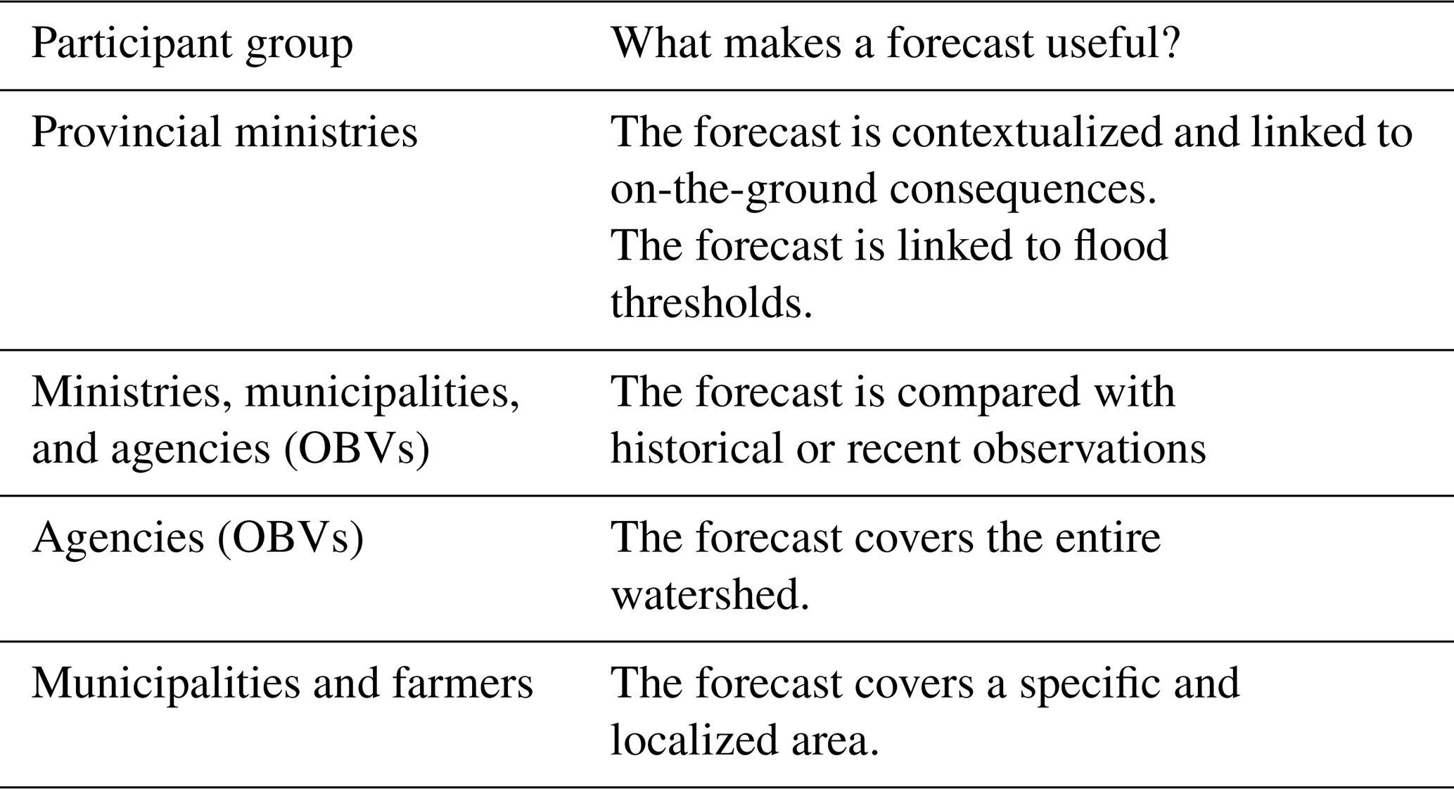
A streamflow forecast, I find really useless if we have no idea of the consequences [a flood] can have on the territory from my point of view, in terms of civil security. (Une prévision de débit, je trouve que c’est vraiment inutile si on n’a aucune idée de la conséquence que cela peut avoir sur le territoire de mon point de vue, en termes de sécurité civile.)
Others (from all participant groups) considered that the usefulness of a forecast was linked to the possibility of comparing the forecast with recent and historical observations. For all users, forecasts provided one way to learn about a potential flood; however, forecasts were never the only source. Respondents commented that a comparison with other available information is always part of interpreting the forecast, with this information most often being field observations and weather forecasts. For example, the fire chief of a municipal fire department explained the following:
Each morning, we have a public works crew that conducts observations. We rely on the data we have obtained from previous years. Photographs that we have in our archives. We keep pictures from previous years with the discharge to give us an idea of what it's going to look like. (On a une équipe des travaux publics qui fait les observations tous les matins. On se fie sur les données qu’on a des autres années. Des photographies qu’on a dans nos archives. On garde des photos des années précédentes avec les débits pour nous donner une idée de ça va avoir l’air de quoi.)
Municipalities, farmers, and OBVs are most concerned with their own specific territory, i.e., the territory in which they are responsible for constituents’ safety (municipalities), the territory representing land as a working space (farmers), and the watershed (OBVs). Useful forecasts must therefore be specific to their particular territory of responsibility. For example, municipalities must know whether the flow forecast is associated with a point upstream or downstream of the municipal area. Farmers require the forecast to be reliable at a sufficiently fine spatial scale to be able to locate their property and confirm whether a flood will impact them.
OBVs require forecasts covering an entire watershed. As with municipalities, the location and number of hydrometric stations play a key role in the potential usefulness of forecasts for OBVs. First, forecast points often coincide with hydrometric stations. Where this is the case, forecasts can be verified through a comparison with observations. Moreover, OBV and municipal users understand that the hydrological model is calibrated based on observations; therefore, they intuitively know that the model and, by extension, the forecasts are better when multiple hydrometric stations cover the watershed. For example, the OBV manager of a large watershed believed that hydrologic forecasts are very useful in general; however, given that a single station on a single stream served as a sole flow measurement point in their watershed, these forecasts were viewed as being unrepresentative of conditions across the watershed.
4.1.3 Optimal forecast horizon
A large proportion of participants (68 % for government ministries and 48 % for municipalities) considered a 1 d to 3 d time frame optimal and sufficient for making their decisions (Fig. 3). For example, the following was explained by a municipal fire chief:
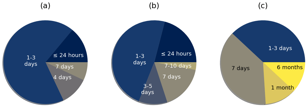
Figure 3Preferred forecast time horizon according to (a) ministries, (b) municipalities, and (c) agencies.
I have time to set up all my procedures in 24 h, thus a shorter, more accurate reading for me is very relevant. (J’ai le temps de mettre en place tous mes mécanismes en 24 heures donc une lecture plus courte et plus précise pour moi c’est très pertinent.)
However, a forecast for a 7 d time horizon, even if the uncertainty is greater, remains a relevant time frame, especially for agencies (38 %) and municipalities (17 %). Furthermore, small municipalities often do not have a permanent team at their disposal; thus, they need more time to mobilize resources, as reiterated by a civil security officer of a small municipality:
It depends on your capacity. I'm a small organization. With the resources that I have, the time I need (is greater) because I don't have many people. (Ça dépend de ta capacité. Moi je suis une petite organisation. Avec les ressources que j’ai, le temps dont j’ai besoin (est plus grand) parce que je n’ai pas beaucoup de gens.)
Two organizations also mentioned the need for very long-term forecasts (1 month or 6 months). Although the forecast visualization tool assessed here is for short-term forecasts, other needs clearly exist.
4.1.4 Temporal resolution and frequency of publication
Participants were asked about their preference in terms of the temporal resolution and frequency of publication. According to the answers, it was evident that those two concepts were confused by several participants, regardless of respondent type, and required further explanation. For instance, some participants believed that a forecast with a finer temporal breakdown, e.g., hourly rather than daily, was recalculated more often.
Once this confusion was overcome, participants explained that a known temporal resolution made it easier to adjust actions within the available time horizon and to focus interventions (Fig. 4). Those participants involved in deciding what actions to take in a flood situation desired a fine to very fine temporal resolution, for instance 1 h, or “as fine as possible”. A total of 40 % of municipal representatives, 33.5 % of ministerial representatives, and 25 % of the agencies indicated that they would like a time resolution of 1 h or less. However, ministries and agencies not directly involved in the field during a flood did not require such a fine temporal resolution. Rather, they required a 6 h or 6–12 h time step. A quarter of ministerial representatives even mentioned a 24 h time step.
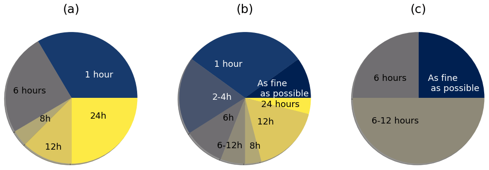
Figure 4Preferred temporal resolution according to (a) ministries, (b) municipalities, and (c) agencies.
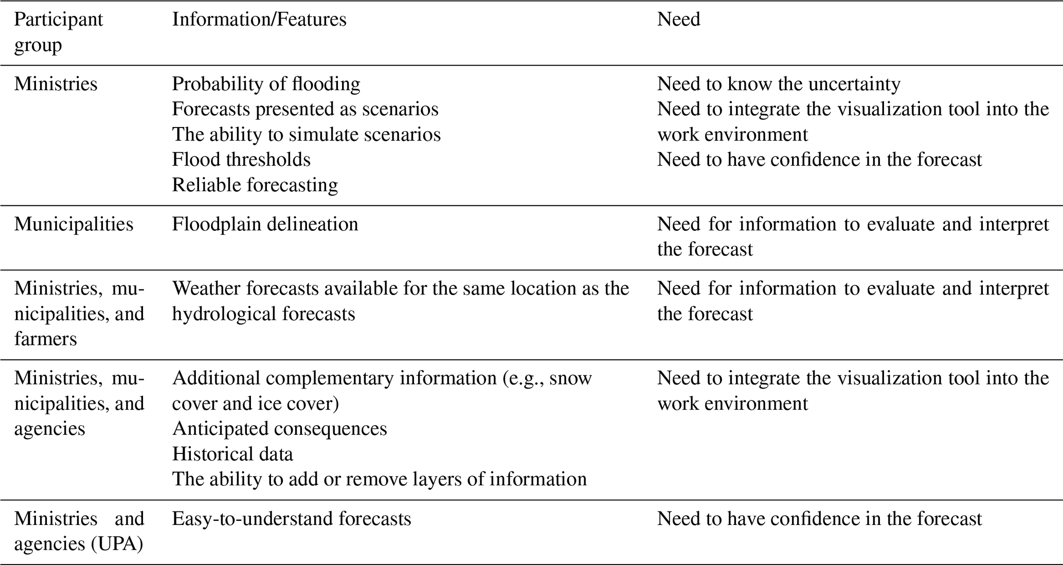
The responses regarding the frequency of updates produced no clear pattern (Fig. 5). Ministerial representatives preferred either a 12 h (28.5 %) or 24 h (24 %) update frequency. Similarly, 22 % of municipal representatives and 37.5 % of agency representatives also preferred a 24 h update frequency. Several participants raised concerns about the technical constraints associated with more frequent forecast updates, and these responses were sometimes tinged with this preconception. On the other hand, several participants mentioned that the forecasts arrived too late in the day. Although indirectly linked to the frequency of forecast updates, this observation suggests that the timing of forecasts and their dissemination to users, rather than frequency, should be adapted.
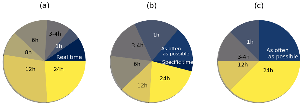
Figure 5Preferred frequency of forecast publication according to (a) ministries, (b) municipalities, and (c) agencies.
4.1.5 Desired features and information in the forecast viewer
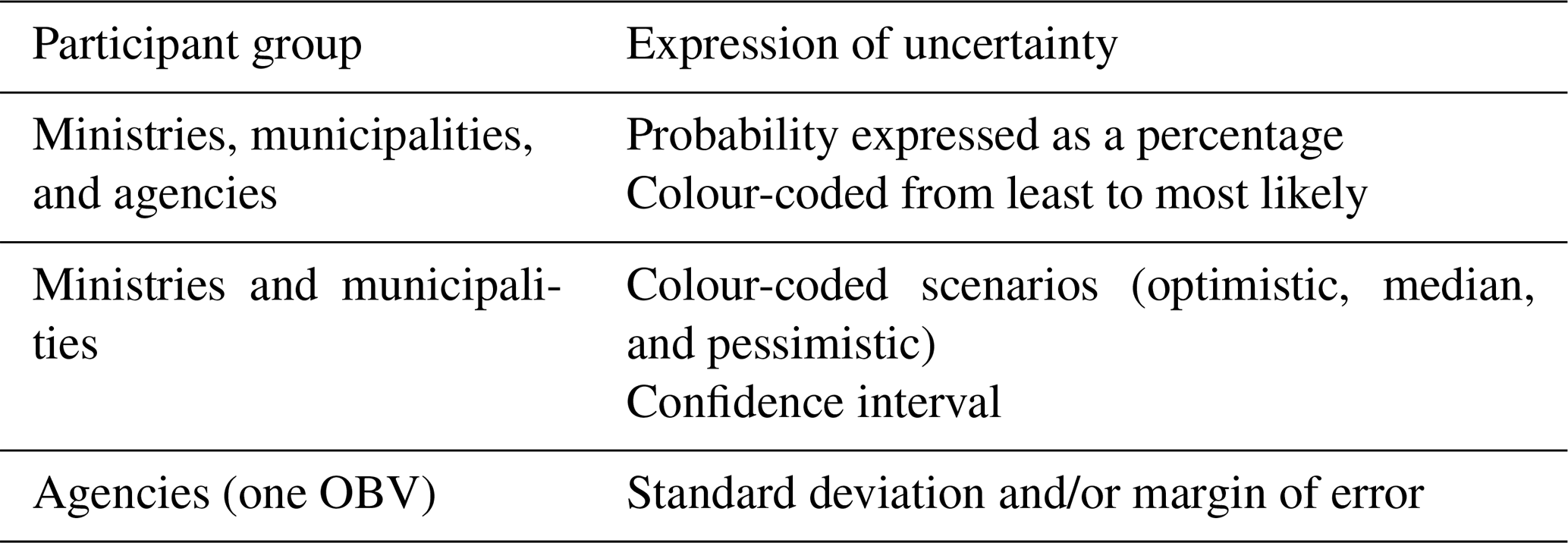
The features and information sought by the participants with respect to the visualization tool addressed four needs (Table 2). The first was to have information to allow for an accurate interpretation of the hydrological forecast. This requires that references are obtained to facilitate the interpretation. An accurate interpretation can rely on the delineation of flood zones, identified potential consequences of flooding, and included weather forecasts, historical data, and flood thresholds.
Other features were related to the need to have confidence in the forecast. For ministerial and agency representatives (UPA), the forecast had to be reliable and easy to integrate into their work environments (Table 2).
Table 2The desired information and features to be found in the visualization tool according to participant group.
Two other important needs were access to information regarding forecast uncertainty, such as the probability of a flooding event occurring, and access to possible scenarios. Only ministerial representatives mentioned this point explicitly; however, all types of users stated this need indirectly, e.g., through their response to another question concerning the representation of uncertainty. Indeed, all participants who were asked about their preference for uncertainty representation understood that hydrological forecasting is necessarily uncertain. Numerous participants in all groups mentioned being accustomed to using precipitation forecasts, for which uncertainty is provided as a probability. For these respondents, precipitation forecasts are a known reference to which they can relate, and many would like to see the uncertainty in hydrological forecast expressed in an analogous manner to that of precipitation forecasts.
This issue of representing uncertainty stimulated much discussion, and many participants raised the idea of a colour code to represent various scenarios or probabilities (Table 3). Some participants (ministries and municipalities) wished for uncertainty to be represented with a confidence interval to place the forecast within a range of possibilities.
The issue of probabilities, particularly in relation to precipitation probabilities, is discussed further in Sect. 5.
Table 3Preferences for the expression of uncertainty by participant group.
Most users were very familiar with maps and their possible use in this context. They also had high expectations for a hydrological forecast in map form. The elements named by the participants met three main needs (Table 4). The first was the ability to find one’s way around the real territory. Participants wanted the map to include geographic and toponymic information as well as administrative and land-use information. The location of hydrometric stations was also deemed essential, especially for ministries responsible for large areas.
Table 4Elements to include on a flood forecast map according to the various participant groups.
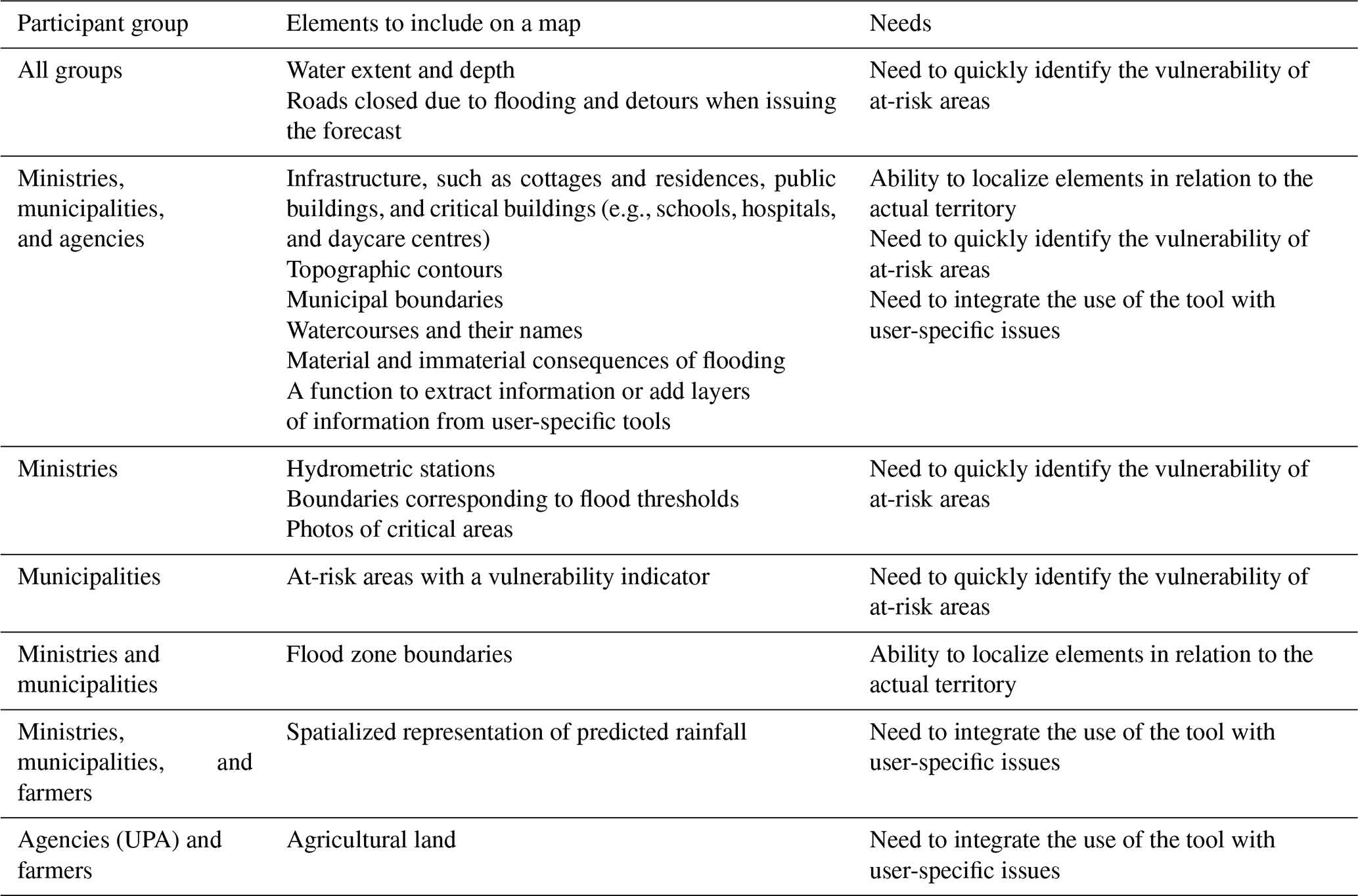
The second need is the ability to quickly identify at-risk areas. The identified elements were the spatial representation of the flooded area according to the forecast, contour lines to evaluate the most problematic sectors, and the presentation of all types of consequences. Moreover, these elements included landmarks such as the limits of floodable areas, the flooded area according to various flood thresholds, and photos of the sensitive sectors. Finally, a spatial representation of predicted precipitation, e.g., storm-affected zones, was considered by some participants (and various types of users) as important information to anticipate the specific areas most at risk. Finally, for all organizations, integrating the forecasting tool into their respective work environments was essential. Beyond the ability to access different forecast scenarios through the visualization tool, participants desired the ability to extract raw data or remove or add layers of map information to adjust the visualization to their specific needs.
4.2 Presentation of the prototypes: understanding and preferences
To further probe the participants’ understanding and preferences regarding the visualization of hydrological forecasts, we presented four prototypes that differed in how forecasts were communicated.
The four prototypes were developed using guidance from a literature review conducted jointly by the first and second authors (Valérie Jean and Marie-Amélie Boucher). This literature review allowed us to identify best practices for visualizing probabilistic forecasts, in hydrology but also in other fields with more abundant literature on communication issues (e.g., hurricanes, forest fires, etc.). For instance, regarding the choice of a colour map, tones of blue and “traffic-light” scales were often recommended. The discussions between the four coauthors started from those recommendations, and we designed the prototypes according to other elements that we wanted to verify: the choice of words, the use of numbers, different ways to separate probability categories, different ways of expressing the probabilities themselves, etc. The prototypes were produced (in French) by the last author (Dominic Roussel) and his colleagues at the Direction de l'Expertise Hydrique of the provincial government. They were constructed using screenshots of HEC-RAS for the Jacques-Cartier River, modified in Microsoft PowerPoint. They were then translated into English for this paper by the second author (Marie-Amélie Boucher).
We wished to assess whether the included elements were relevant and clear to the respondents and whether the way of communicating forecast uncertainty was understood and useful for decision-making. All prototypes assumed that the user could intervene via the prototype interface and select certain elements, e.g., forecast time horizon, probability level, and flow values. Because of several participants who described Prototype 3 as requiring expert knowledge, we did not present it to the citizens and farmers.
Before the presentation of each prototype, we asked participants about their preferences for the colour scale. Existing literature (e.g., Carr et al., 2016) has identified the two most intuitive types of scales as the blue scale for water and the traffic-light scale; thus, these were the two scales presented to our participants. Participants from municipalities, organizations, and farmers overwhelmingly preferred the blue scale to represent water on the map. Representatives from government ministries and citizens liked both colour scales about equally. Positive ratings for the blue scale can be explained by the common use of blue to represent water on a map. Some participants also mentioned that the blue scale was less alarmist. Positive ratings for the traffic-light scale reflected risk being better represented by different colours and the more visible contrast between green, yellow, and red. In Sect. 4.2.1 through Sect. 4.2.4, all prototypes are presented using the blue scale; however, in our interviews and discussions, we adjusted this colour scale (either blue or traffic light) depending on participant preference.
4.2.1 Prototype 1
For Prototype 1 (Fig. 6), each participant was asked to select a probability that water would exceed the displayed depth, and the map served to visualize the extent and depth of the water. This prototype allowed the user to choose the most useful probability or compare maps corresponding to various overflow probabilities. This choice was made from a five-point probability scale manipulated with a slider. A legend using a colour gradient indicated the various depths.
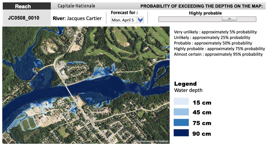
Figure 6Prototype 1, for which the user chooses a river section, an exceedance probability, and a date (among limited possibilities). The map shows the water depth and the corresponding extent. This figure was created by the Ministère de l’Environnement et de la Lutte contre les Changements Climatiques, using screenshots from a HEC-RAS model that they have implemented themselves, including a copyright-free background aerial map from Données Québec (2022). The figure was created in Microsoft PowerPoint, using the aforementioned screenshot as a starting point.
Several ministerial and municipal representatives appreciated this prototype and found that information was presented clearly (Table 5). The ability for the user to select a probability for which the map then presented the water extent and depth was appreciated by several ministerial representatives. Municipal representatives also explained that this prototype would be useful for communicating information to elected officials when they need to justify actions to be taken in a flood situation.
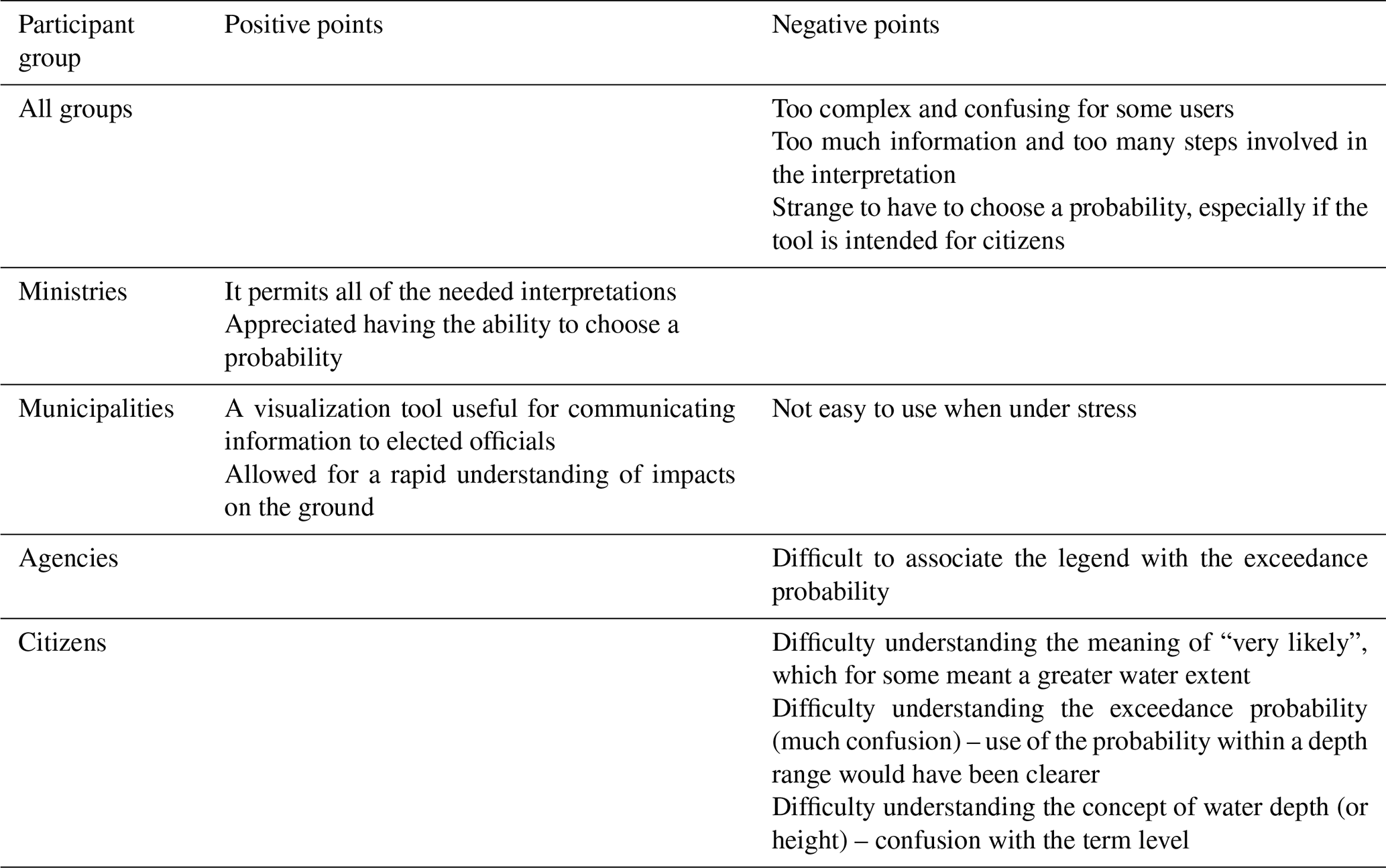
However, several items were problematic. Some participants mentioned that there was too much information to interpret and that the prototype was too complex. Others found it strange that the user had to choose a probability, rather than this being responsibility of forecasters. A citizen using this prototype stated the following:
I don't understand how I select what is going to happen. I had it in my head that I would actually be told. (Je ne comprends pas comment je sélectionne ce qui va se passer. J’avais en tête qu’on me le dirait en fait.)
Note, however, that this critique contradicts the above-cited comments regarding the importance of uncertainty for users. This contradiction will be discussed further in Sect. 5.
Some participants also explained that they would forget how to read the forecast in a crisis when stress was running high. For example, the following is a quote from a municipal fire chief:
It's easy for us right now we're not on alert. But with a little bit of stress, I'm not sure we're going to be able to play around with it. It's great what you have there, but there needs to be a more readable and easier way to seize that information. (C’est facile pour nous en ce moment on n’est pas en état d’alerte. Mais avec un peu de stress, je ne suis pas certain qu’on va être capable de jouer avec tout ça. C’est super bon ce que vous avez-là, mais il faudrait une manière plus lisible et plus facile d’adhérer à ces informations-là.)
Many citizens also found the prototype difficult to understand. For some participants the term was more likely associated with a greater extent of water, despite the term relating to the probability of exceeding a given depth. A citizen stated the following:
But for me, when you presented that to me “likely”, “unlikely”, “very likely”, you just lost me. (Mais moi, quand vous m’avez présenté ça, “probable”, “peu probable”, “très probable”, vous venez de me perdre.)
Moreover, some participants confused depth with level, which complicated the interpretation of the probability of overflowing.
Across all user groups, the concept of exceedance probability was easier to understand than the non-exceedance probability. Many participants commented that it is important to avoid negative formulas and that the exceedance probability better reflected the situation during a flood. Some users preferred choosing the probability of reaching a specific depth or the probability of flood level falling within a given depth interval. These comments, which reflect a misunderstanding of hydrological and hydraulic forecasts and probability, are discussed in Sect. 5.
The notion of exceedance probability was difficult to grasp, and the meaning of depth was confused with that of level. Moreover, depth was mentioned as being not very relevant for farmers and some citizens, as even a centimetre of water can be problematic. The most important information for many people, particularly for citizens and farmers, was the spatial extent of the water, regardless of its depth. For these users, the tool must answer the following question: how far will the water reach onto my fields or land?
Across all user groups, some participants preferred that probability be represented as a number, whereas others preferred words. Nonetheless, all found it useful to use both words and numbers together. The main difference was the preferred order. Most respondents (ministries, agencies, citizens, and farmers) preferred the qualitative worded expression first, followed by the associated percentage. However, a slight majority of respondents from municipalities preferred the opposite ordering of percentage then words.
For all groups of participants, it was overwhelmingly more intuitive to use water level to indicate water beyond the river’s low-flow channel. As mentioned above, the words depth and height were often confused with the notion of level. For citizens, this confusion was quite apparent, and using this prototype became problematic.
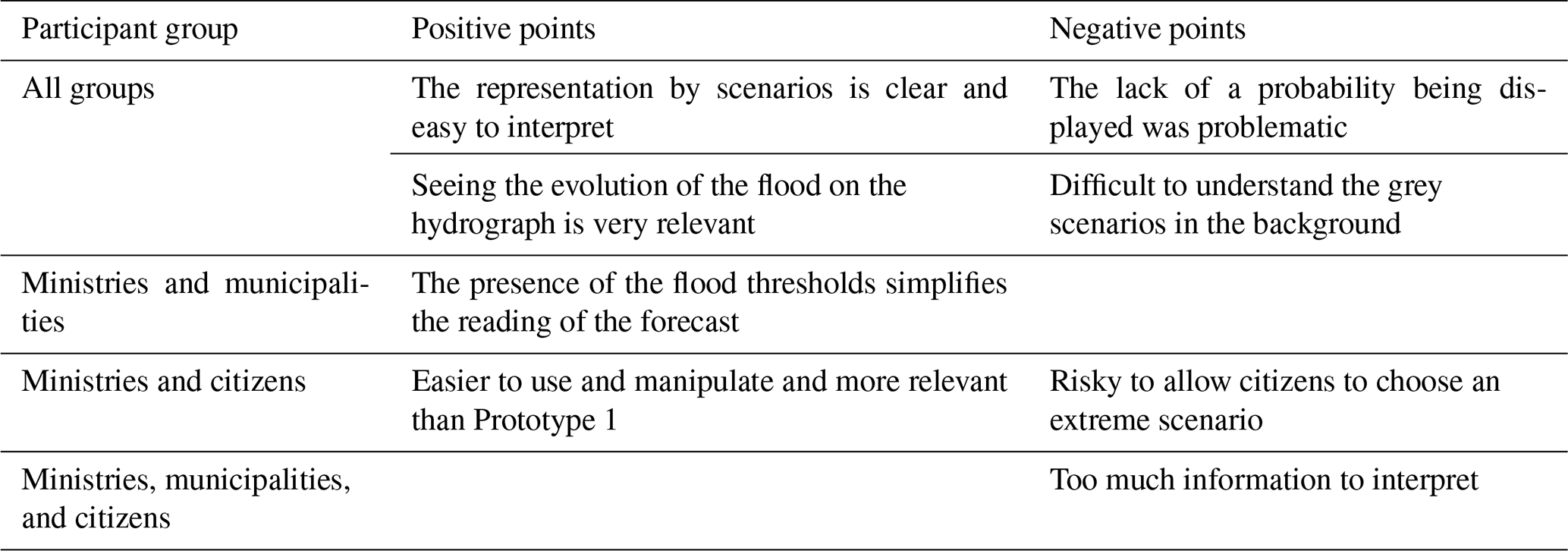
4.2.2 Prototype 2
Prototype 2 (Fig. 7) replaced the slider and probability scale with a hydrograph that presented different flow scenarios predicted for the coming days. Geographically, the location of the forecasted hydrograph corresponded to a red dot on the map, which also corresponded to the location of the hydrometric station if the section was gauged. Using the hydrograph, the user could choose among a median scenario, a low-water scenario, and a high-water scenario. Each scenario had a curve illustrating the expected flood evolution. Flood thresholds already known to several users (threshold flow values) were also represented on the hydrograph through transverse lines to allow the user to evaluate various scenarios. The only reference to uncertainty is the background representation of the other expected flow scenarios (grey lines) and the positioning of the scenario chosen by the user (red line) in relation to the set of possible scenarios.
The user also had to select a date using a drop-down menu. The resulting map then represented the water extent for the selected date and the associated expected flow scenario (low, medium, or high). Depth intervals were expressed by a colour gradient.
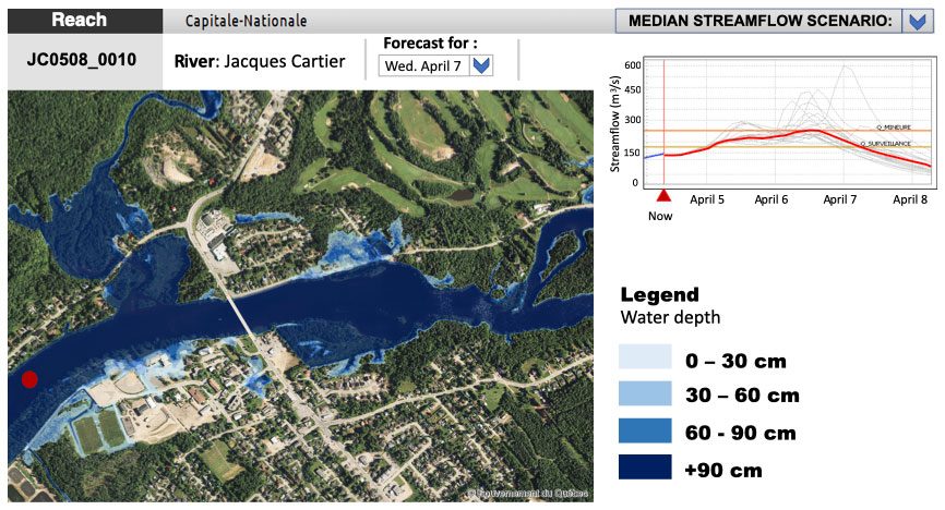
Figure 7Prototype 2, for which the user selects a river section, a predicted flow scenario, and a date. This figure was created by the Ministère de l’Environnement et de la Lutte contre les Changements Climatiques, using screenshots from a HEC-RAS model that they have implemented themselves, including a copyright-free background aerial map from Données Québec (2022). The figure was created in Microsoft PowerPoint, using the aforementioned screenshot as a starting point.
Several participants from all user groups appreciated this prototype and found the information presented to be clear (Table 6). The hydrograph was particularly appreciated, and presenting the forecast by scenario was deemed pertinent. Moreover, the ability to observe the evolution of the flood over time was greatly appreciated, as expressed by a municipal management adviser of the Ministry of Municipal Affairs and Housing:
I like it. There is a lot of information, but, in my opinion, I am satisfied with all the information that is there. Because I have the time period and thus the temporality, we can also play with the flow scenarios... I like this one compared to [Prototype 1] where you have to assume the probability. (Moi j’aime bien ça, il y a beaucoup d’information, mais à mon avis toutes les informations qui sont là me satisfont. À cause que j’ai la période de temps donc la temporalité, on peut jouer aussi avec les scénarios de débit...j’aime bien celle-là comparativement à l’autre dans laquelle c’est toi qui dois assumer la probabilité.)
The inclusion of cross-sectional lines in the hydrograph to represent flood thresholds was particularly appreciated by ministerial and municipal respondents, especially the ability to observe flood evolution directly in relation to these thresholds. Many users found it particularly useful to visually identify when the predicted flow reached a flood threshold. Many participants commented that this prototype was easier to use than Prototype 1.
Certain elements did cause some difficulty in interpretation or created questions on the part of participants (Table 6). One common critique was the lack of probability associated with the scenarios. Many participants felt that they were missing information about uncertainty and could not interpret the meaning of the grey-shaded scenarios in the background as an indicator of the associated probability. This comment was consistent with their (unrealistic) desire to know the probability of occurrence of a specific flow value. In other words, the participants did not accept that the scenarios are equiprobable. Also, some participants did not realize that, by definition, the probability of exceeding (or not exceeding) the median is 50 %. The director of public works for a municipality stated the following:
I think it would also be good to include a probability next to the median scenario. Because in Prototype 1, we talked about the probability of this happening, so we should include the same element. What is the probability that the average or median flow will occur? Maybe it would be good to have the probability next to it. (Moi je pense que ça serait bon également de mettre une probabilité à côté du scénario médian. Parce que dans la maquette 1, on parlait de probabilités que ça arrive, alors, il faudrait apporter le même élément. Quelle est la probabilité que le débit moyen ou médian arrive? Ça serait peut-être bon d’avoir la probabilité à côté.)
Certain users found it risky to allow citizens to choose an extreme scenario. Moreover, as with the other prototypes, some participants found that there remained too much information to interpret. Farmers (four of five) did not like this prototype.
4.2.3 Prototype 3
As with the previous prototype, Prototype 3 (Fig. 8) also included a predicted hydrograph (scenarios in grey); however, the user did not select a scenario but rather chose a fixed flow value, and the map displayed the extent and water depth corresponding to this flow (represented as depth intervals using the colour gradient).

Figure 8Prototype 3, where the user selects a river section and a fixed flow value, although this value is not necessarily related to the flow forecast, which is shown in grey in the hydrograph. This figure was created by the Ministère de l’Environnement et de la Lutte contre les Changements Climatiques, using screenshots from a HEC-RAS model that they have implemented themselves, including a copyright-free background aerial map from Données Québec (2022). The figure was created in Microsoft PowerPoint, using the aforementioned screenshot as a starting point.
Opinions regarding this prototype were very polarized (Table 7). Some participants greatly appreciated this prototype, whereas others hated this visualization. Those participants who had a more positive view of this proposed prototype found that the relationship between flow and flood extent was better shown in this prototype than the other presented prototypes. These users felt that this prototype would complement the flow forecasts to which they already had access. These participants either used flow forecasts already or understood that flow values could be problematic for the rivers of their particular interest. These participants also liked being able to select any flow value and set their own thresholds. For example, a civil engineering technician from Ministry of Transport stated the following:
That's interesting because we can determine our critical thresholds with that. If the infrastructure thresholds are not previously determined, we can have fun if we want to determine them ourselves. (Ça, c’est intéressant parce qu’on peut déterminer nos seuils critiques avec ça. Si les seuils d’infrastructure ne sont pas préalablement déterminés, on peut s’amuser si on veut à les déterminer soi-même.)
Finally, many users felt this prototype had an educational aspect and could be useful in their work to simulate a potential situation and note its effects on the map. On the other hand, whether they liked the prototype or not, all participants stated that the link to forecasting was much less clear. For participants (from all groups) who were not familiar with critical flows, choosing a flow value on their own seemed very arbitrary. This element led many to state that this prototype should be reserved for experts; thus, this prototype is not for everyone, as sustained by a chief executive officer of a municipality:
I expect to have data that are analysed, not to have to analyse data, so I think I prefer the second prototype and to rely on something that has been worked on by professionals. (Moi je m’attends à avoir des données qui sont analysées, par à devoir analyser des données donc je pense que je préfère la deuxième maquette. Me fier sur quelque chose qui a été travaillé par des professionnels finalement.)
Some municipal safety officials mentioned that interpreting this prototype would be more difficult and less useful for decision-making in a crisis. They also noted that, unlike previous prototypes, this prototype would make it more challenging to communicate a crisis to elected officials and citizens. Finally, certain agency participants felt that there was too much information to interpret.
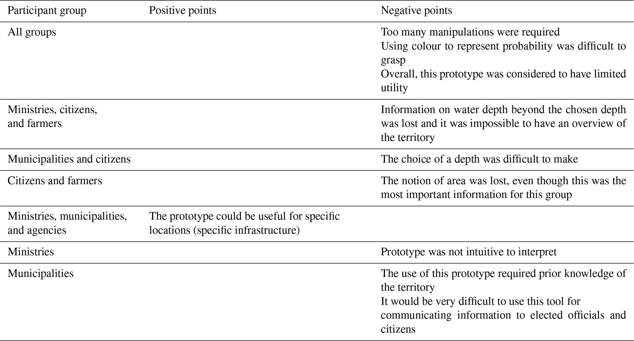
4.2.4 Prototype 4
Prototype 4 (Fig. 9) inverses the presentation of Prototype 1, as the colour displayed on the map in this prototype indicated a probability interval rather than water depth. The user selected a depth using a slider or a drop-down menu, and the map presented the probability of exceeding that depth.
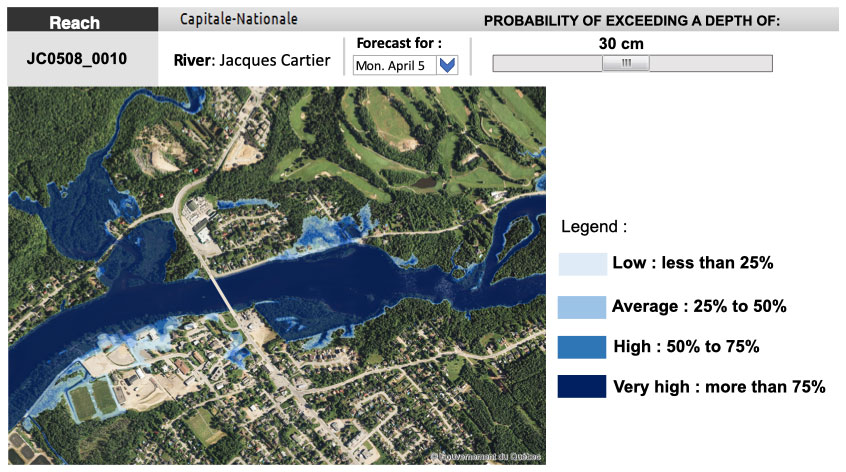
Figure 9Prototype 4, for which the user chooses a river section, a water depth, and a date (among limited possibilities). The map shows the probability of exceeding the selected water depth. This figure was created by the Ministère de l’Environnement et de la Lutte contre les Changements Climatiques, using screenshots from a HEC-RAS model that they have implemented themselves, including a copyright-free background aerial map from Données Québec (2022). The figure was created in Microsoft PowerPoint, using the aforementioned screenshot as a starting point.
Overall, the users deemed the usefulness of this prototype to be quite limited (Table 8). Certain participants mentioned that this prototype could be relevant in specific cases where one is interested in a particular infrastructure or a very circumscribed location. Nonetheless, the general agreement was that the prototype was not adequate. An initial problem identified by all groups of participants was the number of required manipulations. Moreover, using the blue colour to represent probability rather than the extent of the water was considered counterintuitive to express probabilities by several participants who had initially chosen this blue colour scale with the mindset that blue would represent a quantity of water (not a probability). Some users mentioned that the blue scale was preferable for other prototypes (1 to 3) but that the traffic-light colour scale would have been more appropriate for Prototype 4. Moreover, citizens and farmers expressed very negative views toward this prototype, given its less explicit notion of extent, as this information is a priority for this participant group. According to some users, this prototype required prior knowledge of the territory, and municipal representatives stated that this prototype would make it very difficult to communicate information to elected officials and citizens. The director of services for a municipality explained the following:
It's going to be hard to explain this. I see myself trying to present this to elected officials, phew! It seems like it's more real when the colour represents a thickness of water. (Ça va être difficile d’expliquer ça, je me vois essayer de présenter ça aux élus, ouf! On dirait que c’est plus réel quand la couleur représente une épaisseur d’eau.)
4.2.5 Ranking of the prototypes
Prototype 2 was preferred by all user groups (Fig. 10), except agencies (for whom it was ranked second best). Prototype 4 was the least preferred, being the third- and fourth-most preferred prototype for all participant groups (Fig. 10d). Prototype 3 was not presented to citizens and farmers.
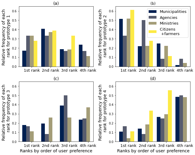
Figure 10Ranking of preference by user groups for (a) Prototype 1, (b) Prototype 2, (c) Prototype 3, and (d) Prototype 4 for municipalities (blue), agencies (yellow), Quebec government ministries (green), and citizens and farmers (red). Note that citizens and farmers did not evaluate Prototype 3. The first rank indicates that this prototype was the group’s preference, whereas the fourth rank indicates the least-liked prototype.
The feedback that we received from this broad survey was very diverse. Here, we draw out the main findings and present recommendations with respect to visualization tools for hydrological forecasts. Comments regarding Prototype 1 concerned the forecaster–user relationship. Specifically, some users would prefer that the forecaster or organization responsible for the forecast select the relevant exceedance probability; thus, only the scenario corresponding to this exceedance probability should be presented. This preference becomes almost equivalent to translating a probabilistic forecast into a deterministic one. The graphical representation of such a forecast would be much easier, as it involves only one scenario, and the information about the uncertainty would probably be limited to mentioning the selected exceedance probability. On the other hand, if the forecaster decides on the exceedance probability to present, they are, in a sense, guiding the decision-making and stepping beyond their role, as mentioned by Krzysztofowicz (2001) and Matte et al. (2017). Allowing the user to select among different exceedance probabilities provides the user with the entire predictive distribution and, thus, all information related to uncertainty. For Krzysztofowicz (2001), providing the decision-maker with this complete picture of uncertainty separates the roles of the forecaster and the decision-maker. As an example, Krzysztofowicz (2001) cites the major flooding in Grand Forks, Manitoba, Canada, in 1997 where the (deterministic) forecast was wrong in projecting that the water level of the Red River would remain below 49 ft (14.93 m). For an untrained user, this would imply a decision to protect infrastructure only up to 49 ft. As the water level eventually crested above this projected level, the forecaster was held responsible for both the incorrect forecast and the incorrect decisions regarding infrastructure protection, when these latter decisions were not part of the forecaster’s responsibilities.
Participants also desired using the tool to run scenarios (see Table 2; especially for Prototype 1). This comment indicates a great deal of enthusiasm for hydrological and hydraulic modelling and a desire to have access to all possible information. However, it also highlights some confusion between the visual representation of information and the modelling software and the weather forecasts that feed the model. We thus identified an interest in training to accompany users of the visualization tool to properly interpret the provided information and a need to explain how the forecasts are obtained. The meetings with the various groups revealed that many participants are very interested in hydrology and would like to be reassured in regard to certain questions, such as “Is the entire watershed taken into account when calculating the forecast?” or “How is snowmelt considered in the forecasting process?”. These questions and the user interest are positive and should be used as a basis for developing training tailored to the various user groups. Also, it can be gleaned from these questions and our discussions that most users have a perceptual model of the hydrological cycle (Beven, 2012; Westerberg et al., 2017) derived from their experiences and observations, and the users want to ensure that the procedural models used operationally (HYDROTEL and HEC-RAS) match their perceptual model. Likely, a better understanding of the modelling tools and the hydrological forecasting process would help users understand the final product and promote its informed use for decision-making.
It was apparent throughout the interviews that the interpretation of probabilities was problematic. Participants would often refer to the probability of precipitation, which is widely known information. Although authors have shown that precipitation probabilities are sometimes misinterpreted (e.g., Joslyn et al., 2009; Morss et al., 2010), people are familiar with the concept and would like it to be transferable to flow forecasts – hence the desire to know the probability that the flow will be equal to a specific value, e.g., “a 70 % probability that the flow will be 10 m3 s−1 tomorrow”, which would be akin to the phrase “a 70 % probability of precipitation tomorrow”. Thus, participants do not realize, at least not immediately, that the probability of precipitation is calculated by taking the proportion of scenarios that predict non-zero precipitation (regardless of the value) and that there are also scenarios that predict zero precipitation. It is reasonable to say that the geographical area covered by our study has no ephemeral rivers except for very small streams. In this context, and unlike precipitation, flow – both observed and forecast – is never zero. Furthermore, how flow forecasts are generated and fed into the hydraulic model to obtain extent and depth forecasts remains unknown to the public. It is counterintuitive for most to accept that the different scenarios are equiprobable. This, coupled with the users’ most familiar reference (the probability of precipitation), explains why several users expressed this desire to know the probability associated with a specific value of predicted flow. In the above-mentioned example, 70 % of the predicted flow scenarios would have to be exactly equal to 10 m3 s−1 for the sentence to be true, whereas the various scenarios usually all have slightly different values in reality.
The concept of exceedance (or non-exceedance) probability was new to most of our interviewees, requiring much effort on their part to interpret. Moreover, we often heard comments regarding the exceedance probability associated with the median, suggesting that many people have a basic difficulty with the concept of probability.
Thus, we face a dilemma between the need to convey all information about uncertainty to the decision-maker and the need to simplify this information as much as possible to make the information easily understood and analysed. For spatialized flood forecasts, uncertainty is not only limited to predicted flow scenarios. Uncertainty is present in the discharge, height, extent, and the temporal aspects of flooding. Most people interviewed from all groups were aware that hydrologic forecasts are uncertain and wished to be informed of this uncertainty. Some also expressed interest in a host of additional information, e.g., an overlay with spatialized precipitation forecasts, which would increase the level of complexity. On the other hand, the interpretation of probabilities was problematic, and some users felt that they were modifying the forecast by selecting an exceedance probability, which indicates rather a need to simplify the information as much as possible. To reconcile these contradictory findings, we recommend first that the visualization tool be tailored to the audience and, therefore, that institutional users have access to more information than citizens. Secondly, citizens and farmers identified that flooding extent is much more important than water depth; this insight could help simplify the visualization of forecasts offered to citizens. Flood forecasts are uncertain in all three spatial dimensions (and in time). It is also difficult to represent this multifaceted uncertainty clearly on a two-dimensional plane, i.e., a map. On the other hand, eliminating the notion of depth also eliminates vertical uncertainty, and (in addition to the notion of temporal uncertainty) the uncertainty in two dimensions must be presented on the forecast map, which is a task that is already much simpler.
Prototype 1, while mainly receiving positive comments, showed some interpretation difficulties. Prototype 2 stands out because it represents the notion of uncertainty without resorting to probabilities (using scenarios). Moreover, this prototype presents different scenarios on the hydrograph that accompanies the map to convey the notion of temporal and spatial uncertainty, without making the interpretation too cumbersome. Prototype 2, as presented to the participants, is only a starting point that can certainly be improved, although we believe that it offers a good foundation. Regarding the colour scale, the majority of participants preferred the blue scale, so we recommend its adoption.
We conducted this large-scale survey as part of the upgrade of an operational hydrological forecasting service that will integrate flood depth and extent forecasts with flow forecasts, which have been publicly available for several years. All forecasts are probabilistic, which will allow users to have a complete picture of the expected situation to make informed decisions. However, the visualization and communication of probabilistic forecasts of water depth and extent are far from trivial given that it becomes necessary to clearly and simply convey information (hydrological forecast) of a phenomenon that is both temporally and spatially uncertain. Operational probabilistic forecasts of water depth and extent are only starting to be implemented and published worldwide. This study is the first one targeted at proposing and assessing visualization tools for that type of forecast. Even if our study took place in a specific geographical context (the province of Quebec, Canada), the questions that were asked to participants were general enough so that our findings are relevant and applicable in any culturally similar context, for citizens and decision-makers who have never used flood forecast maps. Questions were exclusively about the visualization and communication of forecasts as well as their usefulness for decision-making. Participants were not asked questions that would have been closely linked to their geographical location, such as questions about flood-generating mechanisms, for instance.
The participatory approach of this survey revealed the needs and preferences of different groups of users of hydrological forecasts and some difficulties in understanding the presented information, particularly in regard to probabilities but also with respect to the hydrological forecasting process in general. The participants’ comments indicate an enthusiasm and curiosity among users. It also demonstrates that most users have a perceptual model of the hydrologic cycle and, as such, they would like the forecasting models to be compatible with their respective perceptual models.
Although the needs of users and participant groups varied, many of these differences are compatible. For example, the desired forecast horizon was commonly between 1–3 d and 7 d. Therefore, it would be possible to produce a forecast for a 3 d horizon, which includes a shorter horizon from the outset, while also offering a forecast for a longer horizon by indicating the greater uncertainty of this more extended time frame. Moreover, the temporal resolution of the forecast and the frequency of publication would benefit from being increased to meet the wishes expressed by several participants without adversely affecting those less constrained by the timing of publication.
Users mentioned several elements that should be included in a map visualization to facilitate a more straightforward interpretation of the forecast and link to decision-making. The idea is that the forecast visualization tool would gradually become fully integrated into the users’ decision-making processes. Moreover, the participants also showed that they would be interested in training to become familiar with the forecasting process and the visualization tool. Workshops could target elements that should be added to the mapping. We also recommend that feedback from the participatory process is continues and that a dialogue between forecasters and the users of the hydrological forecasts is maintained. Far from being trivial, this dialogue is key to fostering better preparedness and resilience of the territory’s actors to flood hazards. This open communication vis-à-vis hydrological forecasts is essential to ensure the safety of populations and infrastructure.
This qualitative study could be nicely complemented in the future by a quantitative survey, especially after the new flood forecast maps have been available for some time. In fact, at the end of each interview, participants were asked if they would be willing to take part in a follow-up survey or study, and they all agreed. A quantitative study could be helpful not only to further explore the understanding of probabilities by different groups of users but also to collect quantitative data regarding their experience with using hydrometeorological forecasts and how they use those forecasts in a variety of decision-making situations.
The data obtained during this research are confidential and cannot be shared. Given the nature of the of the methodology, no significant codes were developed as part of this research.
VJ, AF, and MAB all participated in the design and conduct of the interviews, although not equally (VJ > AF > MAB). All coauthors participated in the discussion and analysis of the results, although DR was less involved. He provided advice and guidance regarding the operational reality of flood forecasting at the government of Quebec and produced the four prototypes after discussions with the three other authors. The four prototypes were translated by MAB for this paper, and she also prepared Figs. 1, 2, 3, 4, 5, and 10. VJ produced Fig. 2, which was translated by MAB. The text was written by VJ and MAB and proofread by AF and DR.
The contact author has declared that none of the authors has any competing interests.
Publisher’s note: Copernicus Publications remains neutral with regard to jurisdictional claims in published maps and institutional affiliations.
The authors would like to thank Ouranos and the government of Quebec for their support and for providing the funding for this project. They acknowledge the valuable contribution of Helen Hooker and an anonymous reviewer who provided suggestions that improved this paper greatly. The authors are also thankful for all of the participants who so kindly took the time to participate to the interviews and made this work possible.
This research has been supported by Ouranos (grant no. 701100).
This paper was edited by Yue-Ping Xu and reviewed by Helen Hooker and one anonymous referee.
Anderson-Berry, L., Achilles, T., Panduck, S., Mackie, B., Canterford, S., Leck, A., and Brid, D.: Sending a message : how signifiant events have influenced the warnings landscape in Australia, Int. J. Disast. Risk Re., 30, 50–17, 2018. a
Belin, P., Verrhiest-Leblanc, G., and Valantin, P.-Y.: Exploitation des outils d’anticipation des phénomènes pour l’aide à l’anticipation, La Houille Blanche, 3-4, 31–38, 2019. a
Beven, K.: Rainfall-runoff modelling: a primer, 2nd edn., Wiley-Blackwell, ISBN 978-0-470-71459-1, 2012. a
Carr, R., Montz, B., Maxfield, K., Hoekskstra, S., Semmens, K., and Goldman, E.: Effectively communicating risk and uncertainty to the public, B. Am. Meteorol. Soc., 97, 1649–1665, 2016. a, b, c, d, e, f, g
Carr, R., Montz, B., Semmens, K., Maxfield, K., Connolly, S., Ahnert, P., Shedd, R., and Elliott, J.: Major risks, uncertain outcomes : making ensemble forecasts work for multiple audiences, Weather Forecast., 33, 1359–1373, 2018. a, b, c, d, e
Crotti, G., Leandro, J., and Kumar Bhola, P.: A 2D real-time flood forecast framework based on a hybrid historical and synthetic runoff database, Water, 12, 114, https://doi.org/10.3390/w12010114, 2019. a
Demeritt, D., Nobert, S., Cloke, H., and Pappenberger, F.: Challenges in communicating and using ensembles in operational flood forecasting, Meteorol. Appl., 17, 209–222, 2010. a, b
Données Québec: Bassins hydrographiques multiéchelles du Québec, https://www.donneesquebec.ca/recherche/fr/dataset/bassins-hydrographiques-multi-echelles-du-quebec (last access: 10 August 2022), 2018. a
Données Québec: Imagerie aérienne – mosaïques orthophotographiques, https://www.donneesquebec.ca/recherche/dataset/imagerie-aerienne-mosaiques-orthophotographiques (last access: 10 August 2022), 2022. a, b, c, d
Engeset, R. V., Pfuhl, G., Landrø, M., Mannberg, A., and Hetland, A.: Communicating public avalanche warnings – what works?, Nat. Hazards Earth Syst. Sci., 18, 2537–2559, https://doi.org/10.5194/nhess-18-2537-2018, 2018. a
ESRI: World water bodies, https://www.arcgis.com/home/item.html?id=e750071279bf450cbd510454a80f2e63 (last access: 10 August 2022), 2022. a
Frini, A., Besnard, C., Benabbou, L., Adda, M., and Buffin-Bélanger, T.: Outil de priorisation des bassins versants pour la gestion des risques des inondations dans le cadre de la mise en œuvre de l’initiative INFO-Crue au Québec, Tech. rep., Université du Québec à Rimouski, Ouranos, Montréal, https://www.ouranos.ca/wp-content/uploads/RapportFrini2019.pdf (last access: 10 August 2022), 2019. a
Fundel, V., Fleischhut, N., Herzog, S., Göber, M., and Hagedorn, R.: Promoting the use of probabilistic forecasts through a dialogue between scientists, developers ans end-users, Q. J. Roy. Meteor. Soc., 145, 210–231, 2019. a, b, c
Grounds, M., Joslyn, S., and Otsuka, K.: Probabilistic interval forecasts: an individual differences approach to understanding forecast communication, Adv. Meteorol., 2017, 3932565, https://doi.org/10.1155/2017/3932565, 2017. a
Haer, T., Botzen, W., and Aerts, J.: The effectiveness of flood risk communication strategies and the influence of social networks-Insights from an agent-based model, Environ. Sci. Policy, 60, 44–52, 2016. a
Hagaman, A. and Wutich, A.: How Many Interviews Are Enough to Identify Metathemes in Multisited and Cross-cultural Research? Another Perspective on Guest, Bunce, and Johnson’s (2006) Landmark Study, Field Method., 29, 23–42, 2017. a, b, c
Hennink, M. and Kaiser, B.: Sample sizes for saturation in qualitative research: A systematic review of empirical tests, Soc. Sci. Med., 292, 114523, https://doi.org/10.1016/j.socscimed.2021.114523, 2022. a, b, c
Huard, D.: Analyse et intégration d’un degré de confiance aux prévisions de débits en rivière, Tech. rep., David Huard Solution, Quebec, 2013. a, b
Joslyn, S. and Savelli, S.: Forecast uncertainty: public perception of weather forecast uncertainty, Meteorol. Appl., 17, 180–195, 2010. a, b
Joslyn, S., Nadav-Greenberg, L., and Nichols, R.: Probability of precipitation – assessment and enhancement of end-user understanding, B. Am. Meteorol. Soc., 90, 185–194, 2009. a
Kox, T., Gerhold, L., and Ulbrich, U.: Perception and use of uncertainty in severe weather warnings by emergency services in Germany, Atmos. Res., 158–159, 292–301, 2015. a, b
Kox, T., Kempf, H., Lüder, C., Hagedorn, R., and Gerhold, L.: Towards user-oriented weather warnings, Int. J. Disast. Risk Re., 30, 74–80, 2018. a
Krzysztofowicz, R.: The case for probabilistic forecasting in hydrology, J. Hydrol., 249, 2–9, 2001. a, b, c
Matte, S., Boucher, M.-A., Boucher, V., and Fortier Filion, T.-C.: Moving beyond the cost–loss ratio: economic assessment of streamflow forecasts for a risk-averse decision maker, Hydrol. Earth Syst. Sci., 21, 2967–2986, https://doi.org/10.5194/hess-21-2967-2017, 2017. a
Ministère de la Sécurité publique: Plan d'action en matière de sécurité civile relatif aux inondations. Vers une société québécoise plus résiliente aux catastrophes, Tech. Rep. SC-082 (2018-02), Government of Québec, ISBN 978-2-550-80638-7, https://cdn-contenu.quebec.ca/cdn-contenu/adm/min/securite-publique/publications-adm/plans-action/PL_action_inondations_MSP_2018.pdf?1576085553 (last access: 10 August 2022), 2018. a
Morss, R., Lazo, J., and Demuth, J.: Examining the use of weather forecasts in decision scenarios: results from a US survey with implications for uncertainty communication, Meteorol. Appl., 17, 149–162, 2010. a
Møyner Hohle, S. and Halvor Teigen, K.: More than 50 % or less than 70 % chance: pragmatic implications of single-bound probability estimates, J. Behav. Decis. Making, 31, 138–150, 2018. a
November, V., Azémar, A., Lecacheux, S., and Winter, T.: Le couple anticipation/décision aux prises avec l’exceptionnel, l’imprévu et l’incertitude, EchoGéo, 51, https://doi.org/10.4000/echogeo.18949, 2020. a
Padilla, L., Creem-Regehr, S., Hegarty, M., and Stefanucci, J.: Decision making with visualizations: a cognitive framework across disciplines, Cogn. Res. Princ. Implic., 3, 29, https://doi.org/10.1186/s41235-018-0120-9, 2018. a, b, c
Pielke Jr., R. and Carbone, R.: Weather, impacts, forecasts, and policy, B. Am. Meteorol. Soc., 83, 393–403, 2002. a
Ramos, M.-H., Mathevet, T., Thielen, J., and Pappenberger, F.: Communicating uncertainty in hydrometeorological forecasts: mission impossible?, Meteorol. Appl., 17, 223–235, 2010. a
Reghezza-Zitt, M.: Gestion de crise et incertitude(s) ou comment planifier le hors-cadre et l’inimaginable. Application aux crises résultant de crues majeures en Île-de-France, Ann. Georgr., 726, 5–30, https://doi.org/10.3917/ag.726.0005, 2019. a
Roque, A., Wutich, A., Quimby, B., Zheng, M., Hossain, M., and Brewis, A.: Participatory approaches in water research: a review, WIRES Water, 9, E1577, https://doi.org/10.1002/wat2.1577, 2022. a
Speight, L., Cole, S., Moore, R., Pierce, C., Wright, B., Golging, B., Cranston, M., Tavendale, A., Dhondia, J., and Ghimire, S.: Developing surface water flood forecasting capabilities in Scotland: an operational pilot for the 2014 Commonwealth Games in Glasgow, J. Flood Risk Manag., 11, 5884–5901, 2018. a
Statistics Canada: 2021 Census – boundary files, https://www12.statcan.gc.ca/census-recensement/2021/geo/sip-pis/boundary-limites/index2021-eng.cfm?year=21 (last access: 10 August 2022), 2021. a
Stephens, E. M., Spiegelhalter, D., Mylne, K., and Harrison, M.: The Met Office Weather Game: investigating how different methods for presenting probabilistic weather forecasts influence decision-making, Geosci. Commun., 2, 101–116, 2019. a
Westerberg, I., Di Baldassarre, G., and Krueger, T.: Perceptual models of uncertainty for socio-hydrological systems: a flood risk change example, Hydrol. Sci. J., 62, 1705–1713, 2017. a
Wu, W., Emerton, R., Wood, A. W., Wetterhall, F., and Robertson, D. E.: Ensemble flood forecasting: current status and future opportunities, WIRES Water, 7, e1432, https://doi.org/10.1002/wat2.1432, 2020. a
Zarzar, C., Hosseiny, H., Siddique, S., Gomez, M., Smith, V., Mejia, A., and Dyer, J.: A hydraulic multimodel ensemble framework for visualizing flood inundation uncertainty, J. Am. Water Resour. As., 54, 807–819, https://doi.org/10.1111/1752-1688.12656, 2018. a
The survey was conducted in the midst of the Covid-19 pandemic. Municipalities were often overburdened by this situation and, although interested, some simply could not find the time to participate.